Discover more from Aanab News

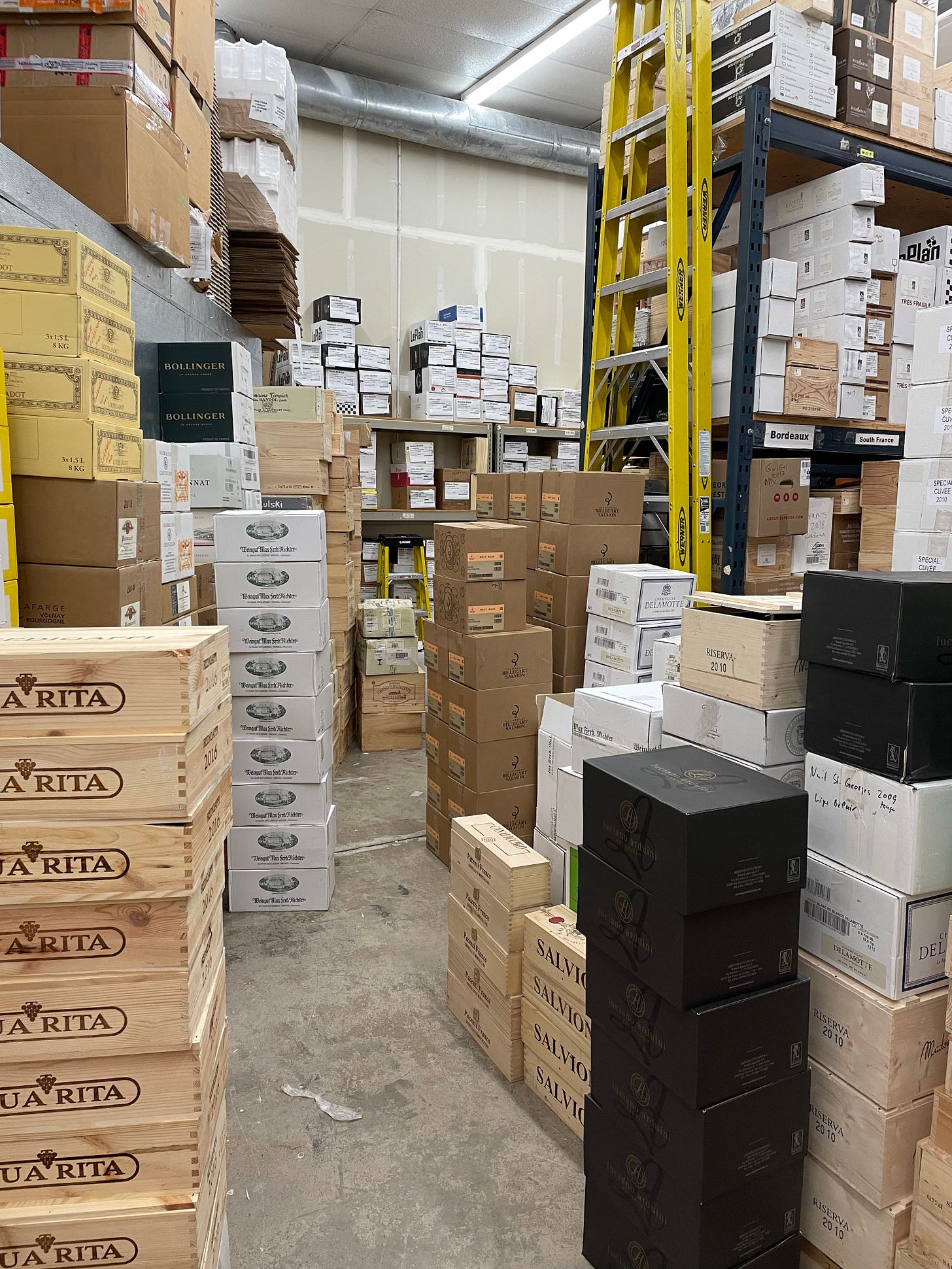
I’ve worked in wine retail for about 5 years. I can’t generalize what’s expected of a salesperson based on my limited experience in two businesses/countries but my job in both was not about staying behind a cash register. I navigated warehouses, stocked fridges and racks, and packed web orders. In the process of locating, merchandising, and storing multiple cases of wine, I noticed an unsung hero in the supply chain: the cardboard box that 3 to 12 (750ml) bottles are packed in.
I’m not referring to cardboard shippers which tend to contain styrofoam (bad!) and are made of heavy-duty corrugated cardboard (which is plain unless branded and provided by couriers). I’m referring to the branded boxes manufactured by wineries that act as their packaging for the units they sell and export.
A LITTLE BACKGROUND ON ME
Wine aside, I am a graphic designer and art director who has worked in advertising which means I’m hardwired to look at a product and its packaging and think about not only what it’s communicating - the brand, how they want to be perceived, and literal information - but also how it functions versus what its function is.
Design is not just about making something look good. It’s about function, communication, and problem solving.
Design is not art.
Design is utilitarian, art is not.
- Massimo Vignelli
Some cardboard cases are used to construct floorstacks and operate like a display in retail settings or simply act as storage in personal cellars so I can see why companies want to coat them in flashy branding but their sole visual purpose is to tell handlers which wine is inside the box quickly and clearly. For the cardboard case, its two functions are 1) to protect what’s inside and 2) to communicate what that is. When brands did this right, it made everyone’s job less taxing. However, it seems for many brands, the people in charge are focusing more on aesthetics and cutting costs leaving handlers to deal with poorly constructed cases that do not serve either of the functions that they’re made for.
WHO ARE YOU DESIGNING FOR?
For single bottles, the deciding factor for design choices is attracting the end user. While unique label design, label placement, seal/wax colors, and bottle shapes help sellers and somms identify bottles, they are not the prioritized user. The customer is who they’re using all these bells and whistles for. I could write a separate breakdown on what to consider when it comes to bottle-specific design. However, for the case the bottles arrive in, the user wineries should prioritize are the handlers between the winery and the final point of sale. Like signage at a subway station, the case is supposed to convey information, not just look pretty. Most of the time, in retail settings, the customer doesn’t see these boxes because the bottles are taken out and stocked in racks or fridges. Therefore, when the box is cluttered with clunky imagery and unnecessary information, it is slowing down the person who needs to read it. If an employee is scanning a wall of cases under SPAIN or CABERNET in the warehouse, they need to be able to detect key information efficiently, not get distracted by irrelevant data. If the customer does buy by the case and stores them in their own cellar, then this functionality of the case design extends to them too.
The handlers should also be kept in mind when considering the case’s construction. The shapes and dimensions of cases are not a one-size-fits-all formula as many are fitted to the bottles they’re made for which come in various formats now (heights, weights, and molds). Still, these are questions that should be asked. Who is carrying this case? Are these dividers sturdy enough to secure the bottles without adding extra weight and waste? If I use perforation, does it impact the integrity of the structure and put my product at risk? Can the structure withstand moisture, humidity and a bump or two? How can I make this package more useful? How can I give it more lives once its primary function ends? What will reduce the likelihood of mistakes in my warehouse and in that of my business partners? How can I make the user’s job as easy as possible so that my wine gets to a customer as seamlessly as possible?
SOME CASE STUDIES AND EXAMPLES
Instead of perforating the box so it can be an in-store display, Pieropan perforates their cases’ lids with punch-out wine tags. While many producers stick the wine’s label on its corresponding box so you match boxes like a memory game, it isn’t very helpful in the case of Dönnhoff because they all look the same at first glance and the differentiating detail is in a script typeface. Domaine Verdet opts for a wise approach of printing a list of all their variants on all boxes and then stamping the vintage next to the name of what the box contains. Randall Grahm’s boxes of The Language of Yes are too uniform so you can’t tell which is the Syrah and which is the Grenache (the bottles’ labels are also confusingly similar). When it comes to form, Müller-Catoir’s packaging consists of branded 6-packs with closures that turn them into wine-briefcases that are manageable singlehanded (instead of using your whole arm) and much lighter than 12-packs.
WHAT ABOUT WOOD?
Despite the implied luxury that wooden crates aim for, they are wasteful and tedious. Cardboard is better for employees and customers in terms of weight and safety (opening them is a hazardous hassle and splinters are no fun) and it is also more cost-friendly for production and shipping which usually varies by weight. Environmentally, cardboard is easily recyclable and more versatile for reuse, even for the retailers themselves (storage or packing orders). No matter how many bookshelves or cat beds I’ve created with Ricasoli crates and Joseph Phelps flat packs, these wooden vessels are a waste of money and material especially when so many are mass produced and cheaply made just to make wines under $50 seem more premium.
WHAT BRANDS SHOULD DO WITH THESE BOXES
Focus on function: As said above, because of the case’s functions legibility and form are what’s important. Gussying up a box that you will need A LOT of is not where your brand’s money should go. Save that chunk of the budget for the bottles or accompanying marketing material. If using the case’s exterior as another opportunity to advertise is the goal, supply separate floorstack dressing that can be used on the salesfloor or employ better designers. Functional design can still be beautiful.
Hierarchy of information and use of color: Internationally traded consumer goods tend to have legally required information and iconography that must be there alongside the more obvious, headlining specs such as brand, wine name, vintage, bottle size, and number of bottles. Knowing how people read text and what they need to register first will help you determine layout, font size, imagery, and what colors to use - including whether you should use more than one color to begin with. In the words of Mies van der Rohe, less is more.
Invent a visual language: If you don’t want to create separate boxes for each bottling, create a system that includes your entire lineup like Verdet. You don’t want to be creating 12 different versions of this one part of your production and you don’t want to keep updating it every few years as your lineup changes. Design a system that is practical yet easily adapted to your future growth.
Most producers know what they’re bottling for at least the next 3-5 years. You can’t avoid updating designs as the business changes but you can avoid costly do-overs by coming up with smart design solutions using the information you have at the start.
In the long run, optimizing function so that things work for you and your users will be one less headache for you and everyone involved in making your brand successful.